Creating an Epi-Curve
Epi-curves are important tools to an epidemiologist or public health official. Epidemiologists (scientists who study patterns and causes of health-related conditions) use epi-curves to analyze occurrences of disease in order to discover the source of the infection. Knowing the source allows effective prevention and control measures to be put in place more quickly.
Objectives
By the end of this lesson, you should be able to:
- Describe an epi-curve.
- Be able to construct an epi-curve from given data.
- Explain why epidemiologist use epi-curves to study an outbreak.
Vocabulary
- epidemic–numbers of disease cases, injuries, or other health conditions greater than expected in an area or population during a particular period.
- epi-curve–a graph that plots the course of an outbreak by time of onset.
- histogram–a graph using bars or columns to represent values in a statistical study; in epidemiology, time is usually plotted on the x-axis with number of cases on the y-axis.
- incubation period–the time period from exposure to an infectious agent to the onset of symptoms of disease.
- index case–the first case of a particular health condition of which health authorities are aware.
- outbreak–the sudden rise in the occurrence of a disease or injury in a given area during a given time period; generally considered to be more localized than an epidemic.
- transmission–any method by which an infectious agent is spread to a host.
An epi-curve is a graph of numbers of disease cases associated with an outbreak or epidemic. The graph is a bar graph with 2 axes that intersect at right angles.
Epi-curves provide epidemiologists with valuable information at a glance. Epi-curves are useful for identifying a possible source contamination, how the disease is transmitted, or for identifying the possible index case. An index case is the initial patient in an outbreak or epidemic, sometimes called Patient Zero.
The (horizontal) x-axis is the date or time of illness onset for the disease cases.
The (vertical) y-axis is the number of cases.
The numbers of cases are plotted to create a bar graph according to dates of onset (when the patient got sick). Usually, the epi-curve is a histogram, meaning that there are no spaces between the columns of bars. Sometimes the cases are represented by stacked boxes—each box representing a separate case of the disease.
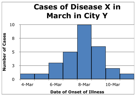
Below is an epi-curve showing:
- the x-axis labeled for date of onset of illness
- the y-axis labeled for the number of cases
- epi-curve title
- patient cases of a specific disease for specific dates
Make sure you label both the x-axis and the y-axis and make sure you title the epi-curve. The title should include the type of illness, location, and time period.
Activity—Constructing an Epi-curve
Ninety-eight cases of mumps have been reported in Columbus, Ohio in November. Construct the epi-curve from the information below.
| Date of Onset | Number of Cases |
|---|---|
| Nov. 7 | 1 |
| Nov. 8 | 1 |
| Nov. 9 | 2 |
| Nov. 10 | 3 |
| Nov. 11 | 5 |
| Nov. 12 | 7 |
| Nov. 13 | 9 |
| Nov. 14 | 9 |
| Nov. 15 | 11 |
| Nov. 16 | 10 |
| Nov. 17 | 9 |
| Nov. 18 | 9 |
| Nov. 19 | 8 |
| Nov. 20 | 7 |
| Nov. 21 | 5 |
| Nov. 22 | 2 |
| Nov. 23 | 0 |